
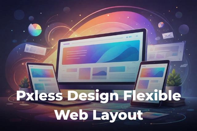
Why do some websites look perfect on every screen while others feel broken or hard to use? The answer often comes down to how they are built. Traditional web design relied on fixed pixel values, but today that approach is slowly fading. A new concept called pxless design is changing how websites are created.
Pxless is not just a technical trend. It is a smarter and more human-friendly way to design websites. Instead of forcing layouts into fixed sizes, pxless design allows content to adjust naturally to different screens, devices, and user settings. This makes websites easier to use, more accessible, and better for modern users.
In this guide, you will learn what pxless means, why it matters, how it works, and how it compares to traditional design methods. We will also look at real examples, benefits, and future trends.
What is Pxless Design? (Quick Answer)
Pxless design is a modern web design approach that avoids fixed pixel (px) units and uses flexible units like %, em, rem, and viewport sizes. This allows websites to adjust automatically based on screen size, device, and user preferences.
Understanding Pxless: Moving Beyond Fixed Pixels
In the past, designers used pixels for everything. A button might be 200px wide. A heading might be 24px. This worked well when most users had similar screen sizes.
But today, things are different. People use:
- Smartphones
- Tablets
- Laptops
- Ultra-wide monitors
- Smart TVs
A fixed pixel design cannot adjust well to all these devices. This is where pxless design helps.
Instead of using fixed values, pxless uses flexible units such as:
- Percent (%) – adjusts based on parent size
- em – based on font size
- rem – based on root font size
- vw / vh – based on screen size
This makes the layout flexible and responsive. It also improves user comfort, similar to how modern display technologies focus on better viewing experiences, as explained in what OLED means.
Why Pxless Design is Important in 2026
The internet is now mobile-first. Over 60% of web traffic comes from mobile devices. This means websites must work perfectly on smaller screens.
Pxless design helps solve this problem by making layouts adaptable.
- Content adjusts automatically
- No need for too many breakpoints
- Better experience on all devices
- Improved accessibility
This shift is similar to how industries are moving toward scalable systems, like in blockchain technology in supply chain, where flexibility and efficiency are key.
Px vs Rem vs Em: What’s the Difference?
To understand pxless design better, you need to know the difference between common CSS units.
- px (pixels) – fixed size, does not change easily
- em – relative to parent element
- rem – relative to root element
- % – relative to container size
Example:
- 16px = fixed size
- 1rem = depends on root font size
- 50% = half of parent width
Pxless design prefers rem and % because they scale better across devices.
Benefits of Pxless Design
Pxless design offers many benefits for both users and developers.
- Better user experience – content feels natural on every screen
- Improved accessibility – users can adjust font size easily
- Less maintenance – fewer layout fixes needed
- Faster development – flexible layouts reduce effort
- Future-proof design – works with new devices
This approach aligns with modern design thinking, where user comfort is more important than strict visual control. Similar ideas are also seen when comparing display technologies like difference between OLED and QLED.
Real-World Examples of Pxless Design
Many modern websites already use pxless design principles.
- Responsive news websites
- E-commerce platforms
- Blogs and content sites
- Mobile-first applications
For example, when you resize a browser window and the layout adjusts smoothly, that is pxless in action.
Frameworks like Bootstrap and Tailwind CSS also encourage flexible units instead of fixed pixels.
How to Use Pxless Design in CSS
Here are simple ways to start using pxless design:
- Use rem for font sizes
- Use % for widths
- Use flexbox or grid layouts
- Avoid fixed pixel heights
Example CSS:
body {
 font-size: 1rem;
}
.container {
 width: 90%;
}
h1 {
 font-size: 2rem;
}
This simple change makes your design more flexible and user-friendly.
Common Mistakes in Pxless Design
Even though pxless design is powerful, many beginners make mistakes.
- Mixing px and rem without purpose
- Using too many units together
- Ignoring testing on real devices
- Overcomplicating layouts
Keep it simple. Use consistent units and test your design on different screens.
Pxless vs Responsive Design: Are They the Same?
Many people think pxless and responsive design are the same, but they are not exactly identical.
- Responsive design uses breakpoints to adjust layout
- Pxless design focuses on flexible units
They work best together. Pxless makes responsive design more efficient and smooth.
Clearing Confusion: Pxless vs Pexels
Some users confuse pxless with similar words like Pexels. But they are completely different.
- Pxless – web design approach
- Pexels – free stock photo website
This confusion is common in search results. Learning from trusted resources, like best crypto learning sites, can help avoid such misunderstandings in digital fields.
The Future of Pxless Design
Pxless design is becoming more popular every year. As devices continue to grow and change, flexible design will become the standard.
Future trends include:
- More focus on accessibility
- AI-based responsive layouts
- Better browser support for flexible units
- Design systems built around scalability
This shift is part of a larger move toward user-focused technology, similar to platforms like ideals virtual data room, where usability and flexibility are key.
The CSS Units Behind Pxless Design

Image source: pexels.com
Pxless design relies on relative units. rem scales with the root font size, em with the parent element, percentages with the containing block, and vw and vh with the viewport. The clamp() function sets a minimum, preferred and maximum value, which makes fluid typography possible without media queries for every breakpoint.
Container Queries Change The Game

Image source: pexels.com
Container queries, now supported in all major browsers, let a component adapt to the size of its container rather than the whole screen. That makes reusable components far more flexible, since the same card can look right in a narrow sidebar or a wide main column.
Accessibility Benefits

Image source: pexels.com
Relative units respect user settings. The Web Content Accessibility Guidelines expect text to be resizable up to 200 per cent without loss of content or functionality, which is much easier when layouts are built with rem and flexible containers rather than fixed pixel widths. Public sector websites in the UK are legally required to meet accessibility standards.
Testing Flexible Layouts
Image source: pexels.com
Test at many widths, not just common device sizes, and with browser zoom and larger default text. Real devices, browser developer tools and automated accessibility checkers each catch different problems. For related reading, see our guide to graphic design tools for beginners.
How We Keep This Guide Up To Date
Rules, prices and services change, so we review guides like this regularly and update them when official sources change. Where the law or official guidance is involved, the relevant government or regulator’s website is always the final word, and it is worth checking there before making an important decision. If something here has changed, the official source will reflect it first.
A Quick Checklist Before You Decide

Image source: pexels.com
Before acting on anything in this guide, run through three quick checks. First, is the information current, and does it apply where you live in the UK, since rules often differ between England, Scotland, Wales and Northern Ireland? Second, have you compared more than one option or provider? Third, do you need professional advice for your specific situation? Taking ten minutes over these questions avoids most expensive mistakes.
FAQ About Pxless Design
What is pxless design?
Pxless design is a method of building websites without fixed pixel units, using flexible units instead.
Is pxless better than pixels?
Yes, for modern websites. It improves flexibility, accessibility, and user experience.
Can I still use px?
Yes, but only when needed. Most layouts should rely on flexible units.
Is pxless good for SEO?
Yes. Better user experience leads to higher engagement and better rankings.
Is pxless hard to learn?
No. It is easy once you understand basic CSS units like rem and %.
Conclusion
Pxless design is not just a trend. It is a smarter way to build websites for today’s digital world. By moving away from fixed pixels, designers can create experiences that feel natural, flexible, and user-friendly.
If you want your website to work well on every device, improve accessibility, and stay future-ready, pxless design is the way forward. It shifts the focus from rigid layouts to real human needs—and that is what modern web design is all about.